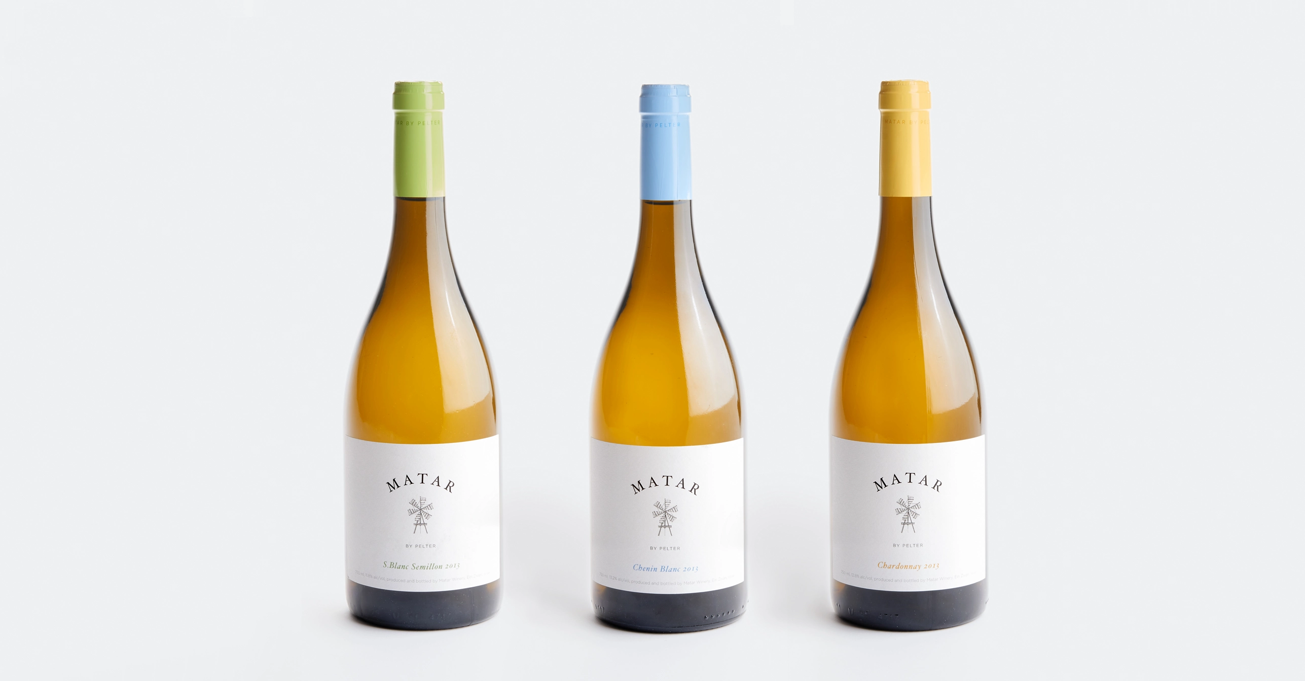
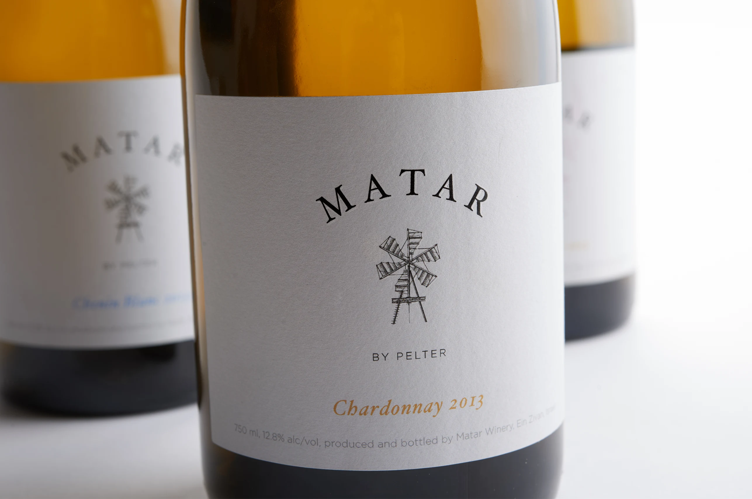
Introducing a younger sister to a successful family is always quite the challenge, especially when dealing with the Pelter family. But with the Matar Winery aimed at the Kosher market, we found a refreshing balance between the established brand, and the bursting energy of the emerging one.
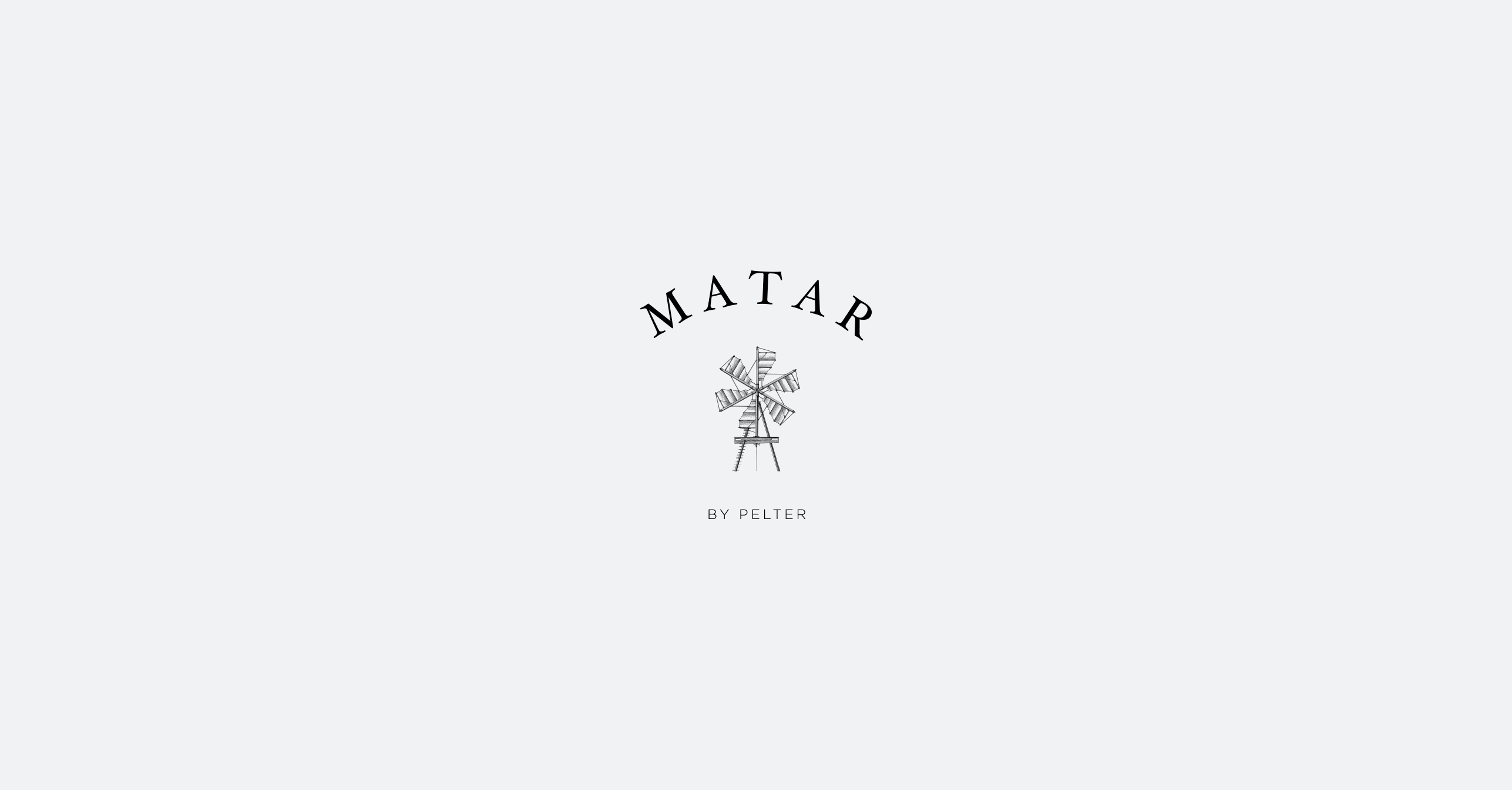
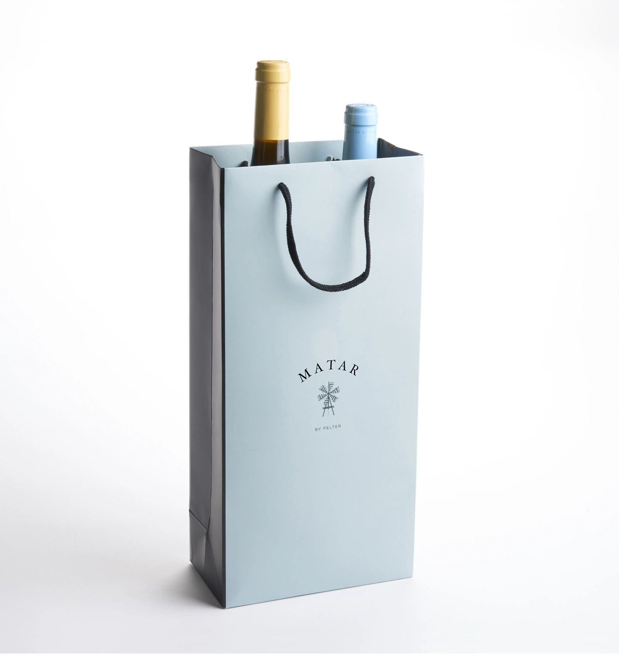
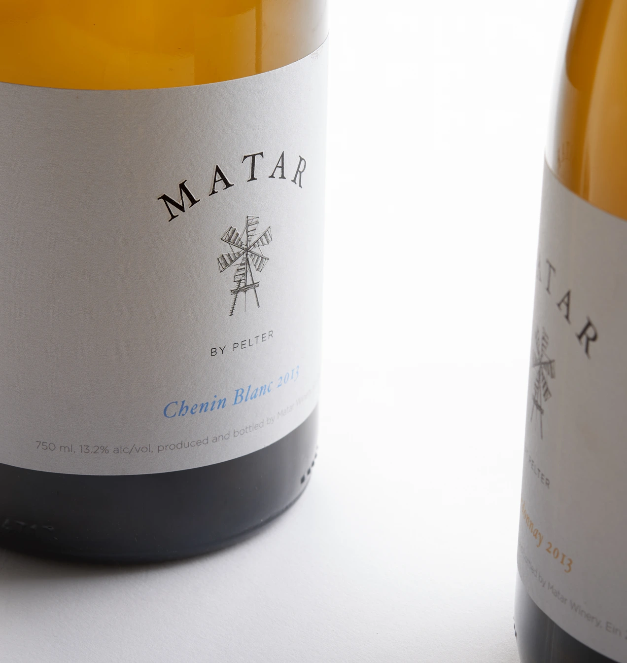
Like its more established kin, the new visual identity makes use of engraved imagery, but instead of Pelter’s iconic butterfly, we created an elegant windmill in the same style, and a fresh pastel color palette aimed at creating visual consistency within the wine family — but also a distinct personality of its own.
Project credits:
Brand Identity: Dov Kroll
Brand Naming & Strategy: Sharon Gesthalter
Illustration: Steven Noble
Photography: Yasmin & Arye Photographers – Studio Ya